A comparison between the current in-game models and the originals from the trilogy.I originally planned on writing this analysis on only the Turians in Andromeda. Something perturbed me the way the in-game models were made in comparison to the older ones of the trilogy (to the point where it was borderline changing canon information.) While gathering my source images, I decided to include some of the other species and point out their issues/differences as well. This analysis will look at things such as texture, posturing, and anatomy/biology of each species.
I mention new races, the main antagonist, and teammates, but other than that I'd like to think this is rather a spoiler free critique/analysis. I'm still just at the beginning of the game myself.
Turians One of the main things I noticed back when we only had a glimpse of the Turian faces in the trailers, was that the new Turian faces appeared very white, or blank in appearance. I’m not talking about a lack of facial markings either, but rather, a very bleached out base, underneath the markings- what would be the natural colors and patterns of each natural born Turian.
Let me pull out my first example, the first Turian we meet in-game, Tiran Kandros.
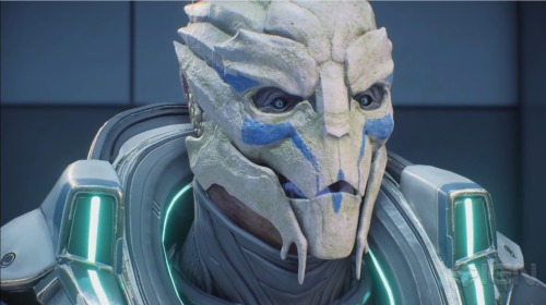
My first thought was “wow, his face is strangely white” and then “Oh, Tiran Kandros? As in, a relative of Nyreen Kandros?” which then led to, “Oh! Nyreen had a very white face as well, perhaps it's a biological trait.”
Unfortunately, my assumption soon proved to be incorrect, as this flat white base crest kept repeating itself with multiple Turians we would come across in-game.
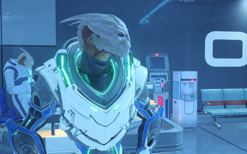
Something else I noticed about the Turians was that, unlike their trilogy predecessors, the male Turians of Andromeda had sealed secondary nostrils.
Here’s a comparison of Kandros (Andromeda) and Chellick (ME1):
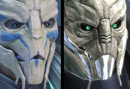
Some of you may be asking, “Well, how do you know those are secondary nostrils?” The answer is honestly- I don’t. However, the way the in-game models were designed before suggests this was an anatomical fact, by leaving such deep grooves in their noses, but also within the concept art:
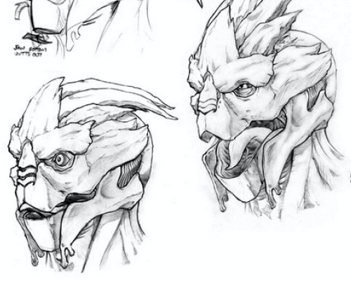
As you can see on the left, the artist very clearly shapes the forms of the nose in such a way that it is an orifice, and on the right when they draw the Turian expressing himself, the nose closes up. Now, of course, this may only be an early design choice, as Turians don’t raise their crests like a stimulated cockatoo (as funny as that would that be) in-game either. Despite this, I think we can all agree that the Turian species does have deep grooves in its nose, whether they are canonically nostrils or not.
Strangely enough, they portray this more accurately with the current female Turian models, although it is still clearly designed as indentations, rather than deep grooves.
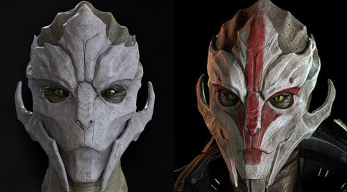
Despite this being ignored, this could have been something easily improved upon by the texture artist. Which leads me to my next point…
There’s simply not enough value changes to properly reveal the various physical forms in the Turian face. Because of this, even with the markings- most Turian faces appear extremely flat.
What I mean by this, is that there aren’t as many shadows in and around certain areas of the face indicating what the forms are. For example, shadows under the cheekbones, the brow line, the jaw line.
I’m making a lot of assumptions here, but it seems like whoever did the texture mapping, did a very flat job.
I say this, because looking at the original models for the faces, they look very well crafted and finely detailed.

My assumption is then, that for whatever reason, they were counting on the raw forms of the game models to add enough depth and shadow, without adding much more from the texture map.
This is still evident in the darker faced Turians, because although they are darker- they lose their features because they aren’t properly shaded/highlighted in the face, aka the values aren’t working or are just plainly not there at all. This CAN change in certain lighting, but it would be better for it to remain consistent throughout the game.
It seems like they added flat color, texture, and the facial markings, without adding additional texture map shadows/highlights. Now let’s look at an old Turian from the trilogy, particularly one without markings, and compare it to a blank-faced Turian from Andromeda.
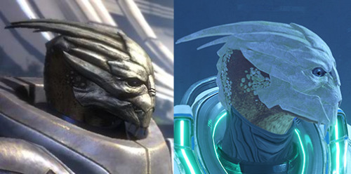
Perhaps you can see it more clearly? There is simply a lack of depth in the faces that I believe can easily be fixed by the texture mapping artist. For comparison, I will do some small edits in photoshop to show how I think this can be improved.
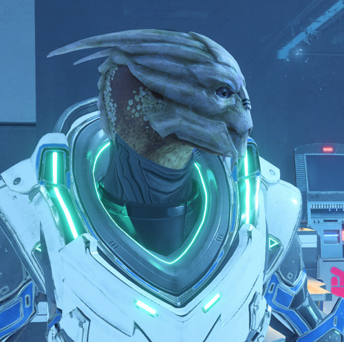
I feel like this has happened in a few other places as well, including the original Human/Asari eyes with the game’s release. They also had just flat colors and didn’t account for the cast shadow that would come from the upper eyelid. The result was well, a soulless stare we all dealt with until the 1.05 patch was released. Of course, the human face issues are a whole other topic. Let’s move on.
Digitigrade Legs A digitigrade is an organism that biologically walks on its toes instead of the entire foot. This includes animals such as dogs, cats, and horses. In contrast, an organism that biologically walks on its entire foot is known as a plantigrade, this includes human beings, most primates, and bears.
In the original Mass Effect, the species were designed in such a way that they could be placed on a “human skeleton.” This is because of the technological barriers they had back in the day, and the animators could only work with so much. The results left us with alien species that are bipedal (walks on two legs) but have digitigrade biology/walking patterns.
Though the Mass Effect species with the “backward knees” aren’t necessarily walking on their toes, they ARE still using the bone/muscle structure of a digitigrade, and thus, are using the physics of digitigrade legs.
Mass Effect species that use this structure are Turian, Quarian, Geth, Salarian and Krogan.
“dog legs” as Jack so lovely put them.
In Andromeda, I’m sure a few of you, like myself, have noticed the awkward ever changing leg patterns of the Turians. Sometimes they are perfectly fine, upright, and other times they look strangely bendy, or- “off balance.” There is a very good reason for this, and it’s all in the placement of the knees in each species. I’ll
try my best to explain this.
First, let’s look at a few “awkward” examples.
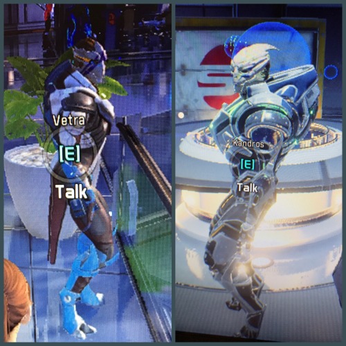
Vetra and Tiran here are probably a good place to start. Looking at these two, it looks as if Tiran is getting ready to do a wall sit, or position himself into a crouch, likewise, Vetra looks like she could spring into a jump at any moment.
It’s a very common thing to see animal legs this way- as constantly 'bent'
In fact, animals like dogs and horses, even though they appear to have 'bent' legs actually do have straight knees, and that’s the crucial part here. There is no mammal that stands upright with constantly bent legs.
Think about how quickly your thighs and calves get tired when you’re doing a wall sit, how quickly you feel the need to straighten your legs out when you do a squat. That’s because knees are biologically designed in such a way to most effectively carry your weight when they are straight and are directly underneath the core of your weight (i.e; hips/body).
It’s important to know how gravity/weight travels down the skeleton and into the ground. Creating digitigrade legs incorrectly will result in the creature/individual looking as if they’re about to fall over, or that they’re crouching, or that they’re about to jump up.
It’s important to visually convey that when in a neutral standing position, the knees are always straight.
Let’s look at how the original Mass Effect models handled this.
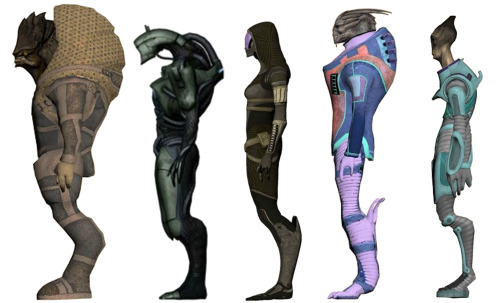
Something to take note of here is that although all of these species look digitigrade, only the Turian and Salarian technically are. Jack calls Tali, a Quarian, “dog legs” but she is, in fact, plantigrade- her entire foot is on the ground, with an exaggerated bend in her shin bones. If there is a joint where her calf muscles should be, they never animated it in-game, or it is very subtle.
In fact, it’s quite arguable who is a true digitigrade here and who isn’t. The most clearly defined is the Krogan, who has an obviously elevated heel, however, it is an addition to the heel which is flat on the ground. Does the Salarian have a joint where his calf muscles should be? Indeed, these are simply speculations. What’s more important are the anatomical design choices made here. Each of these alien species has a unique leg shape, with arguably varying joints and muscle structures, but what is consistent is that the knees are straight, not in front of them, and they are directly underneath the core of their weight. None of these profiles look as if they are about to jump or fall over.
Angara
Whoever it was that put the models in this state, be it a glitch or not (perhaps related to the awkward in-game human leg animations?) was also unaware of this fact while positioning the legs of the new Angara race. Let’s look at some of these guys.
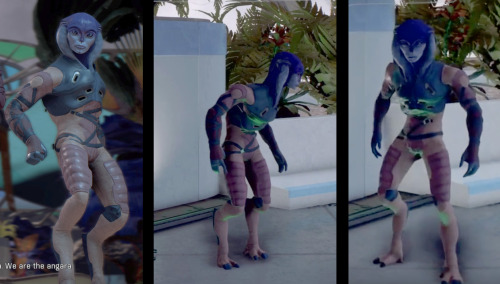
What’s interesting about the Angaran, is that they’re so close to being 100% fine- in fact, I love their design, however, you can see the same thing I pointed out before- that their knees come out in front of them rather than being directly under them. To fix this, all they really need to do is push the knees back OR bring their torsos extremely forward to balance the core of the weight.
The second image here shows a posture they are in sometimes which looks much more normal than the one on the left. This is because being so hunched over actually creates balance for the legs which are already excessively forward.
Krogans I don’t have much in the form of critique for these guys, but rather just comparing their changes for the fun of it and adding some thoughts of my own.
Despite having the same protruding bent knee issues, they aren’t as extreme as the Turians or Angara.
Something I would like to point out, however, is more texture mapping.
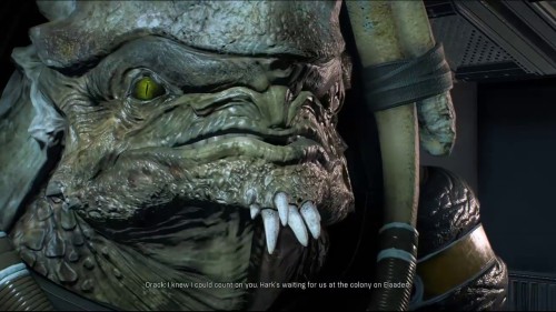
Here’s a nice picture of Drack, our Krogan grandpa. Something that was consistent with the old Krogan designs, however, was the dark skin around the eyes.

That small design choice always gave the Krogans such a predatory glare that I miss quite a bit with their new design. I realize that it wouldn’t work as well with the Krogan who have the darker colored eyes, but I still believe it would have been a nice addition via texture mapping. Along with that, some minor shading in the folds of their bat-like faces and scales. Just a little something extra to give more depth to the original model.
The females have an interesting look about them in this game. I like that they kept the consistency of the smaller, flatter plates on the head/neck. It appears they’ve also widened the hips and given them possibly a bit of a thicker lower lip than the males. All understandable choices. Something I might have done with them, however, is narrow the jawline ever so slightly, just to give that feminine edge, perhaps also a more angular eye. This form of femininity, however, is arguably human in nature, and therefore not necessarily applicable for brutes such as the Krogan. Just a possible design choice.
The Problem With The Archon… He has… well… childlike face proportions.
A large forehead, small jawline, chin, etc…
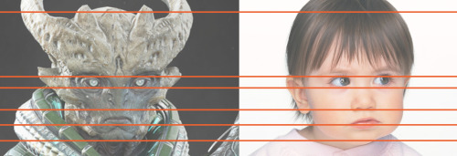
As the main villain, I imagine you’d want to stay away from something like this. But because I haven’t played the game all the way through yet, it’s possible that perhaps he is a young leader? Maybe something to do with the age or reproduction of his species is a core factor in the narrative? I have yet to find out, however, here are some more edits that I thought could be useful.
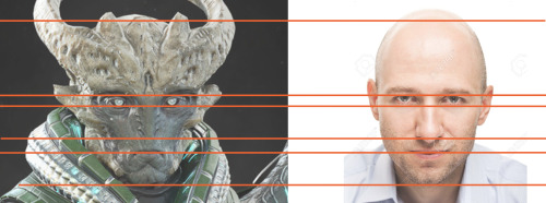
I’ve lengthened his jaw, nose and mouth areas to those of a more average adult. I’ve also slightly scaled down the size of his eyes. I think even these small changes go a long way for the design of the character.
The Kett as a whole seem alright. From what I’ve seen they have texture/model variations of their rocky exoskeleton like bodies and faces which are great. If there is anything to compare/critique it’s only the things I’ve mentioned before, such as the texture mapping and proper positioning of the legs/knees.
Overall I do like their visual design.
Salarians A
huge issue with the Salarians is their eyes. Salarians canonically blink entirely upwards with their bottom eyelid. In Andromeda, they animate them blinking like any other species (both lids but mainly upper) which is a big flaw for those of us who are super nerds and like canon information to stay correct.
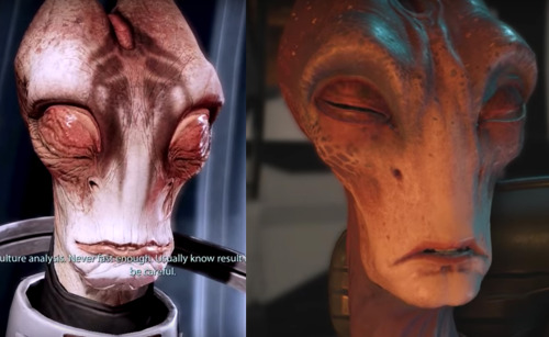
Mordin and Kallo, respectively. You can see the blinking difference very clearly here.
It’s a small animation change, but it’s important to those of us who are so involved with the IP. That’s why there was a few who became frustrated when it was revealed that Peebee had hair on her eyebrows- as Asari physiology in previous games stated they could never have such a thing.
Information was released later that she had remaining “human genes” or something to that extent which could “explain” it.
but that still conflicts with established Asari reproduction methods again from previous games, so, it’s a tricky rope to walk. I understand some things are sacrificed for design choices for overall better visuals but.. it didn't seem like a very necessary change to me.
Back to the Salarians.
Something else I’m sure fewer people have noticed thus far is that the Salarians in Andromeda DO have pupils and the way they have created the Salarian pupils is inaccurate from the original trilogy. Salarians are amphibian and have eyes that mimic this, with pupils that are horizontal. If you peer closely into the dark eyes of Andromeda Salarians, they have vertical slit pupils, which are very inaccurate.
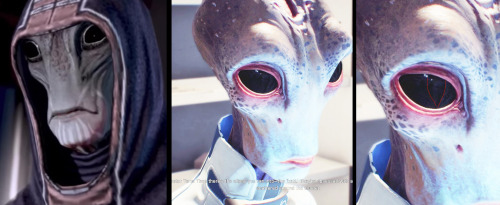
I’ve overexposed the image of Tann so you can see the pupil a bit more clearly. I’ve also traced it in a separate window to the right if you still can’t see it.
So that’s all I have to say so far. As I progress through the game I may come back and add or change a few things to this super nerdy piece of writing/critique/analysis.
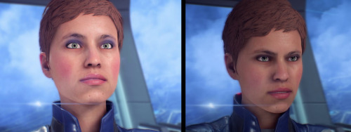
Both Asari and Human species have the same issues which have been addressed many times in the past. In my opinion, they already took the first step by fixing the eyes and adding shadows. Now all they really need to do is drop the chin level in conversations, “half-moon” the iris with the upper lid of the eye, and fix the eye tracking animation to some level.
There are mouth issues sure, but those go less noticed when you have solid eyes/eye animations. You can see here with the last patch that they’ve already done this with Addison.
That's all my thoughts! Thanks for reading.
TL;DR Milky way species have altered visuals that conflict with canon information.
I'd love to hear some feedback. Since this is my first post on this site do let me know if I'm in the wrong place or anything like that.
Do you agree with any of this stuff? Disagree? Am I wrong about texture mapping tech? Thoughts on Turian/Salarian physiology?